This article was published as a part of the Data Science Blogathon
Introduction to Data Visualization
finding the best product optimization strategy, business growth metrics and make other vital decisions. The applications of good visuals are limitless, it can be used for sales forecasting, stock price analysis, managing projects, monitoring web traffic, and so on. They are one example of how digital technology has impacted our everyday life like your car by helping us understand it better.
The human eye is quick to understand patterns and information in a visual way. It is true when said that, a picture speaks a thousand words. Visuals grab our interest and pass the message efficiently. Charts and visuals make information easy to read. Spreadsheets and lists can store data, but interpreting that data can be difficult.

(Image 1: Data Visualization tells a story)
Data findings and visuals need to be properly presented as well. Data visuals must attract the attention of the audience and convey the appropriate message. It doesn’t matter which department or sector, good data analysis, and visualization is a great thing and will be in high demand in the days to come. Be it in finance, marketing, sales, technology, engineering, research, or human resources, data analysis, and visualization are going to be more important in the days to come. Data needs to convey a specific message and explain things clearly, often good visuals make the process easy and simple.
Machine Learning helps in making predictions, doing predictive analytics, and other tasks, similarly good visualizations help in data exploration.
Some ways in which Data Visualization can be used
There are various types of data visualizations and all of them have different purposes and needs.
a) Tracking changes in data over time
Data that has a timestamp associated with it, is considered to be time-series data. Examples of such data can be stock prices, sales data over time, rainfall and temperature at a place along with the time, road traffic at a particular place, and so on. Such data helps in tracking trends and changes over time. We might want to analyze stock prices or see which day of the week, traffic is highest, and so on. So, basically, we check the data trends over time.
b) Understanding correlations
Data is highly related, the sales of a supermarket are highly dependent on the vehicular traffic of the road in front of the supermarket. The number of hours of study in the case of students might lead to higher test scores and so on. So, data visualizations must be such that analysts and users can be aware of relationships in data.
c) Determining Frequency
Count and frequency of items are important, and we need to keep track of them. We need to keep track of how frequently something happens. Many data visualizations help in determining frequency.
d) Analysing importance/ risk/ value
Many data visualizations are made to analyze the distribution of a particular variable and see any importance, or risk or value the data might hold. Data can be tested with various metrics and plotted to understand all the important parameters.
Effective data visualization is a crucial step in analytics.
The increasing importance of Data Analytics
The amount of data and information on the internet is increasing day by day. Our every action online is stored as data, be it our website login, our purchase, an uber trip taken, an online food delivery, everything is tracked. We can confirm that the age of Big Data is almost here. The vast amount of data needs processing and analysis. Data has to be made more understandable, readable, and interpretable. The real-life applications and uses of good data visualization methods are immense. A data-driven organization leverages data to make efficient decisions, and will surely perform better than an organization that does not leverage data.
The advent of large data storage facilities has made data available for various purposes. Large organizations like Google, Facebook, Amazon, etc leverage their data for a wide variety of purposes. Improved business decisions are a direct outcome of data-driven decision-making.
How Data Visualization can help?
- Good visuals help in capturing the attention of the audience and they can understand stuff better.
- Makes data exploration more accessible and easy
- Data insights and visuals can be shared easily
- Understand the information more easily
- Gain better insights
- Make swift data-driven decisions
The case of a School Teacher
Let us consider a hypothetical scenario. A teacher has the marks of all students in her class, along with it she has data for students’ past marks and other grades. All of this data is, however, in spreadsheets. Now, she wants to analyze from her data, which students are performing the best, which students’ exam performance has improved, and which students’ performance has decreased, and so on. All this might be possible with spreadsheets, but the amount of effort that needs to be given is too high. Thankfully, excel has in-built data visualization tools, and the data can be analyzed simply and easily. The teacher can easily check all the data, find out who had the highest score, etc. Data Analysis tools are there to help us in such aspects. Nowadays, we are at the liberty to use Excel, Power BI, Tableau as no-code solutions and we can also use Python and R if we want custom solutions and data pipelines. These tools serve the purpose of processing the data and making our desired visuals. The use of such tools helps us in automating the data visualization process.
History of Data Visualization
Data tells its own tale, properly presented data can explain a lot of things. One of the first known graphs of statistical data was made by Dutch astronomer Michael Florent van Langren. Napoleon Bonaparte’s Russian campaign of 1812 was mapped by Charles Joseph Minard. He used statistical graphs to map the campaign and he combined multiple metrics: the number of troops, temperature, distance, directions, and more to make a proper visual.
Over time, data visualization kept on improving. The advent of computers and displays meant that data could be processed and presented efficiently. Data Visualization tools and software can analyze vast amounts of data at a very high speed.
Use of Python in Data Visualization
Python is an excellent tool for data visualization. Python has been around for a long time and can be used for a wide variety of tasks. It can be used for statistical analysis, machine learning, deep learning, web development, and so on. The easy-to-use nature of Python and a lot of libraries make Python useful for complex numeric and scientific calculations. The uses of Python are immense. The popularity of using Python is also increasing.
Python is open-source, free to use and there are a lot of libraries and support available for Python. Python can also be used on many platforms. Python has many support forums and helps available all over the internet. The great community support for Python and a large number of resources make learning Python for data analysis a great investment. It is flexible and scalable, there is a wide range of libraries and regular updates are available. This can lower the data analysis budget and costs. Purchasing licenses of Power BI and Tableau can be expensive in earlier stages The libraries in Python are constantly evolving, making the process easier and simpler. The data-oriented packages in Python can speed up and simplify the entire data process.
The data analysts’ toolbox can have many tools: Power BI, Tableau, Excel, R etc, but Python must also be a part of it. The hyper flexibility of Python makes it very useful, and it is highly popular among data analysts and data scientists. Python has many IDEs and environments where data can be visualized. One can use Google Colab, Kaggle Kernel, Jupyter Notebooks and so on. The graphical options in Python make using Python very easy for data analysis. Python is evolving constantly, multi-featured and highly functional.

( Image 2: Python is one of the best tools for data visualization)
Libraries in Python for Data Analysis
Python started out as a general-purpose programming language. But, the improved readability of Python made it a good tool for data analysis.
Matplotlib
One of the best tools for data analysis is Matplotlib. It is used for 2-dimensional data analysis and basic plotting, charting, and data representation. It was introduced in 2002 by John Hunter. The introduction of Matplotlib propelled the growth of Python as a tool for research, data analysis, and engineering. The visuals are easy to plot and interpret.
Seaborn
Seaborn is a great visualization library in Python used for plotting statistical models and complex relations among data. It can plot complex plots like Heatmaps, Relational Plots, Categorical Plots, Regression Plots, etc. Seaborn made complex data analysis and visualization easy and simple to execute.
Now, if we consider the limitations of Seaborn and Matplotlib, first of all, they are static plots. The plots are produced as images, they are not interactive. We cannot hover our cursor over the plots and get exact values. We cannot also use them to make interactive plots on websites. A good solution to all this is using Plotly.
Plotly
Plotly is a Montreal-based AI and Analytics company. They focus on the development of Analytics tools, mainly Dash and Chart Studio. They have also released the free and open-source plotting library “Plotly” for Python, R, MatLab, and Julia.
Plotly produces interactive graphs, can be embedded on websites, and provides a wide variety of complex plotting options. The graphs and plots are robust and a wide variety of people can use them. The visuals are of high quality and easy to read and interpret.
Plotly can be used to make a wide variety of charts, including Basic and Statistical charts, Maps, 3D Charts, Subplots, and so on.
Getting started with plotting in Plotly
I have prepared and kept the code in a Kaggle Notebook, I will leave the link later. Please refer to it later so that you are able to understand it. First, we import the necessary libraries.
import numpy as np import pandas as pd import plotly.express as px
Now, we read some data we will be using.
The two datasets used here are:
- Melbourne Housing Snapshot
- Superstore Sales Dataset
Both the datasets are good beginner datasets, with a lot of information and data fields. The Melbourne Housing data has various real estate data points and deals with the housing sector. The data pertains to the housing and commercial property sector.
The superstore data concerns with sales and retail sector. Various aspects of sales and retail are present in the data.
Now, we proceed with reading the data.
melb= pd.read_csv("/kaggle/input/melbourne-housing-snapshot/melb_data.csv")
sales=pd.read_csv("/kaggle/input/sales-forecasting/train.csv")
The Melbourne data is a bit large, for the sake of simplicity, we are taking only 1000 data points from the dataset.
melb=melb[0:1000]
Scatter Plots using Plotly
Scatterplots are a great way to analyze data distribution and the relation between various data fields. Various trends in data can be analyzed and plotted. Plotting scatter plots with Plotly is very easy.
x=[0, 1, 2, 3, 4, 5, 6]
y=[0, 2, 4, 5, 5.5, 7, 9]
fig = px.scatter(x, y)
fig.show()
Output:

The good thing about Plotly is that the plots are interactive. We can hover over the plots and see exact data values and other information. I will share the link to the notebook, where you can have a look. Also, do upvote the Kaggle Notebook, if you like it.
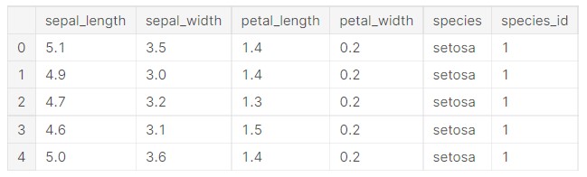
We take the iris dataset now.
df = px.data.iris()
Let us have a look at the data once.
df.head()
Output:
Let us make a scatter plot to understand the data distribution.
fig = px.scatter(df, x="sepal_width", y="sepal_length", color='petal_width')
fig.show()
Output:

Now, we make some changes to the parameters.
fig = px.scatter(df, x="sepal_width", y="sepal_length", color='species')
fig.show()
Output:

Now, adding some styles to the plots.
fig = px.scatter(df, y="petal_length", x="petal_width", color="species", symbol="species")
fig.update_traces(marker_size=10)
Output:

Now, we start plotting some data using the Melbourne dataset.
fig = px.scatter(melb, x="Lattitude", y="Longtitude", marginal_x="histogram", marginal_y="rug",color="Type")
fig.show()
Output:

Now, we add some columns to the plots.
fig = px.scatter(melb, x="Price", y="YearBuilt", color="Type", facet_col="Rooms", )
fig.show()
Output:

Now, we change the parameters.
fig = px.scatter(melb, x="Price", y="YearBuilt", color="Rooms", facet_col="Type", )
fig.show()
Output:

fig = px.scatter(melb, x="BuildingArea", y="Distance", color="Rooms", facet_col="Type", )
fig.show()
Output:

fig = px.scatter(melb, x="BuildingArea", y="Distance", color="Car", facet_col="Type", )
fig.show()
Output:

As we can see, all the plots in Plotly are really nice and well designed. All the colours are great to look at and see.
Regarding, scatterplots, we can also make Linear Regression plots using Plotly. We take the dips dataset, and we plot the linear relationship between total bills and tips.
#linear regression
df = px.data.tips()
fig = px.scatter(df, x="total_bill", y="tip", trendline="ols")
fig.show()
Output:

We can see that the linear plot is quite well made. And, all the plots are interactive.
Check the Kaggle notebook here: Link
Do give an upvote if you like it.
Line Plots using Plotly
Line plots are great in visualizing continuous data. Time series data, mathematical functions etc are some of the data which can be plotted using Line Plots. They reveal data trends, maxima and minima. We can use them for time series data like stocks, sales over time and so on. It is a great way to plot a 2D relationship.
Let us use a line plot to plot a mathematical function.
x = np.linspace(0, 10, 1000)
y= 3*x**2 - 2*x**2 + 4*x- 5
fig = px.line(x=x ,y =y,labels={'x':'x', 'y':'y'})
fig.show()
Output:

The plot is interactive, so we can hover over it to understand the values.
Now, let us plot a sin() function.
 x = np.linspace(0, 10, 1000)
y= np.sin(x)
fig = px.line(x=x ,y =y,labels={'x':'x', 'y':'sin(x)'})
fig.show()
Output:

Now, we shall plot some time series data, starting with some stocks data.
“MSFT” is the stock symbol for Microsoft.
df = px.data.stocks()
fig = px.line(df, x='date', y="MSFT")
fig.show()
Output:

Now, I will include more stocks in the plot.
GOOG stands for Google, FB stands for Facebook and AMZN stands for Amazon.
df = px.data.stocks()
fig = px.line(df, x='date', y=["MSFT","GOOG",'FB',"AMZN"])
fig.show()
Output:

We can see that all the plots are visually appealing and look nice with contrasting colours.
Now, we use some data from the Plotly library for some sample plotting.
df = px.data.gapminder().query("continent == 'Oceania'")
Let us check how the data looks like.
df.head()
Output:

We plot the data on a line plot now.
fig = px.line(df, x='year', y='pop', color='country')
fig.show()
Output:

We can see that the plot card also shows the data and other parameters on a convenient line plot. Now, adding some markers so that the data is easily visible.
fig = px.line(df, x='year', y='pop', color='country',markers=True)
fig.show()
Output:

The plot has been made!
Now, a plot with different types of visuals will be made.
import plotly.graph_objects as go
#combined plots
N=100
random_x = np.linspace(0, 5, N)
random_y0 = np.random.randn(N) + 5
random_y1 = np.random.randn(N)
random_y2 = np.random.randn(N) - 5
fig = go.Figure()
# Add traces
fig.add_trace(go.Scatter(x=random_x, y=random_y0, mode='lines+markers', name='lines+markers'))
fig.add_trace(go.Scatter(x=random_x, y=random_y1, mode='markers', name='markers'))
fig.add_trace(go.Scatter(x=random_x, y=random_y2, mode='lines', name='lines'))
fig.show()
Such a type of plot is called a combined plot.
Output:

Such combined plots are a great way to understand the data from different perspectives.
Bar Plots using Plotly
Barplots are used to provide a straightforward comparison of data. They represent categorical data with rectangular bars of variable height. Plotting bar charts in Plotly is very easy and simple. Let us start by plotting the population of Australia over time.
df = px.data.gapminder().query("country == 'Australia'")
fig = px.bar(df, x='year', y='pop')
fig.show()
Output:

Let us work on the sales data, we had taken earlier. But, for the sake of simplicity, we take only the initial 100 data points.
sales=sales[0:100]
Let us plot sales in each US State.
fig = px.bar(sales, x="State", y="Sales")
fig.show()
Output:

It also individually shows the sales figure of each sale.
Now, we analyze the sales category, for that we bring in another parameter.
fig = px.bar(sales, x="State", y="Sales",color='Category')
fig.show()
Output:

Now, we plot the sales of each category and add a parameter to distinguish segments.
fig = px.bar(sales, x="Category", y="Sales",color='Segment')
fig.show()
Output:

Next, we give a pattern shape to the plots.
fig = px.bar(sales, x="Category", y="Sales",color="Segment",pattern_shape="Segment", pattern_shape_sequence=[".", "x", "+"])
fig.show()
Output:

Now, let us add hues and more advanced colour interpretations to a plot. These improve the readability of the plot.
data = px.data.gapminder()
data_canada = data[data.country == 'Canada']
fig = px.bar(data_canada, x='year', y='pop', hover_data=['lifeExp', 'gdpPercap'], color='lifeExp', labels={'pop':'population of Canada'}, height=400)
fig.show()
Output:

We can clearly see here, that with time, the population of Canada increased, and also life expectancy also increased. Better healthcare, improved medicines and increased quality of life lead to this.
The hue of life expectancy becomes brighter, as shown in the colour bar to the right.
Now, let us check the GDP per capita.
fig = px.bar(data_canada, x='year', y='pop', hover_data=['lifeExp', 'gdpPercap'], color='gdpPercap', labels={'pop':'population of Canada'}, height=400)
fig.show()
Output:

The GDP per capita improved over time and we can take that as an indication that general life quality improved with time.
Let us make some stacked bar charts. One important thing to be considered while plotting and data representation are that, we need to understand when to plot which data, and which data is important when. Choosing the right type of charts is very important. This prevents any visualisation mistakes.
Let us take into consideration some new data.
df = px.data.gapminder().query("continent == 'Oceania'")
Let us see how the data looks like.
df.head()
Output:

Let us see how we can plot the stacked bar charts.
fig = px.bar(df, x='year', y='pop',barmode='stack',color='country')
fig.show()
Output:

Stacked bar charts show the summation of individual entries as well the entire plot. So, it is a good way to understand the contribution of each individual factor towards a complete entity.
Let us see the life expectancy data.
fig = px.bar(df, x='year', y='lifeExp',barmode='stack',color='country')
fig.show()
Output:

Let us see some more custom visuals.
x = ['Suzuki', 'Honda', 'Tata']
y = [100, 40, 60]
# Use the hovertext kw argument for hover text
fig = go.Figure(data=[go.Bar(x=x, y=y, hovertext=['50 % Share', '20 % Share', '30 % Share'])])
fig.update_layout(title_text='Sales Data')
fig.show()
Output:

Let us plot the populations of the most populous nations in Asia.
#uniform text size
df = px.data.gapminder().query("continent == 'Asia' and year == 2007and pop > 8000000")
fig = px.bar(df, y='pop', x='country', text='pop')
fig.update_traces(texttemplate='%{text:.2s}', textposition='outside')
fig.show()
Output:

So, we plotted a wide variety of bar plots and analysed data. Let us try a different type of plot now.
Pie Chart using Plotly
Pie charts are used to understand the composition of data and analyse part to whole relationships in data. Piecharts ( and doughnut charts) plot the percentage composition of a value, as compared to the entire data/value.
Let us take into consideration the sales dataset again. We plot a piechart of the sales from each state. The percentage contribution of each state will get plotted. This will show many valuable insights.
fig = px.pie(sales, values='Sales', names='State', title='Sales Per State in US')
fig.show()
Output:

So, we can see that majority of the sales is from California.
Now, we plot the sales segments and their contribution.
fig = px.pie(sales, values='Sales', names='Segment', title='Sales Per Segment in US')
fig.show()
Output:

Now, we see the sales per category.
fig = px.pie(sales, values='Sales', names='Category', title='Sales Per Category in US')
fig.show()
Output:

So, we can see that Furniture was sold, the highest.
Now, we will make some more advanced plots, and we shall be using the tips dataset.
#setting colours
df = px.data.tips()
fig = px.pie(df, values='tip', names='day', color_discrete_sequence=px.colors.sequential.RdBu)
fig.show()
Output:

So, the plots are entirely customizable.
labels = ['Apple','Microsoft','Amazon','Alphabet']
values = [2252, 1966, 1711, 1538]
fig = go.Figure(data=[go.Pie(labels=labels, values=values, textinfo='label+percent', insidetextorientation='radial' )])
fig.show()
Output:

Let us make a doughnut chart now.
#donut chart
labels = ['CAR','BIKE','BUS','TRAIN']
values = [1500, 2500, 6800, 9000]
fig = go.Figure(data=[go.Pie(labels=labels, values=values, hole=.3)])
fig.show()
Output:

The real difference between a doughnut chart and a pie chart is mainly the appearance and the way someone wants to plot the data.
Let us now make the chart a little bit customised.
#donut chart
labels = ['CAR','BIKE','BUS','TRAIN']
values = [1500, 2500, 6800, 9000]
fig = go.Figure(data=[go.Pie(labels=labels, values=values, pull=[0.1, 0.1, 0.2, 0.1])])
fig.show()
Output:

So, we can see that Plotly offers a high level of customisation and visually appealing plots.
Check out the code here: Kaggle
Bubble Charts using Plotly
Bubble Charts are a great way to show magnitude, by adjusting the size of the circle. Bubble Charts can be easily made in Python.
fig = go.Figure(data=[go.Scatter( x=[1, 2, 3, 4], y=[10, 12, 15, 16], mode='markers', marker_size=[20, 40, 50, 60])
])
fig.show()
Output:

The plot is made easily.
df = px.data.gapminder()
fig = px.scatter(df.query("year==2007"), x="gdpPercap", y="lifeExp", size="pop", color="continent", hover_name="country", log_x=True, size_max=60)
fig.show()
Output:

Let us use the tips data again.
fig = px.scatter(tips, x="total_bill", y="size", size="tip", color="tip", size_max=20)
fig.show()
Output:

Bubble charts are a great way to visualise data and understand insights.
Dot Plots using Plotly
Dot Plots are a different way of presenting scatter plots and show the data distribution properly.
We are taking a new dataset.
stud= pd.read_csv("/kaggle/input/students-performance-in-exams/StudentsPerformance.csv")
I will share the link to all codes in the end, please have a look there.
fig = px.scatter(stud, x="math score", y="parental level of education", color="gender", title="Student Performance in Exams" )
fig.show()
Output:

Let us try another plot.
fig = px.scatter(stud, x="writing score", y="parental level of education", color="lunch", title="Student Performance in Exams" )
fig.show()
Output:

Horizontal Bar Chart using Plotly
Horizontal bar charts are just a way to interpret the traditional bar chart.
fig = px.bar(stud, x="reading score", y="parental level of education",color='gender', orientation='h')
fig.show()
Output:

Gantt Chart
Gantt Chart is a special type of bar chart that shows the progress of a project or work. Different sections of a bigger project can be plotted based on their timelines and progress.
Let us plot some sample Gantt Charts.
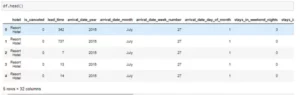
df = pd.DataFrame([ dict(Task="Development", Start='2012-01-20', Finish='2012-02-20'), dict(Task="Website Design", Start='2012-01-10', Finish='2012-01-30'), dict(Task="Deployment", Start='2012-02-20', Finish='2012-03-30'), dict(Task="Marketing", Start='2012-02-25', Finish='2012-04-15')
])
fig = px.timeline(df, x_start="Start", x_end="Finish", y="Task")
fig.update_yaxes(autorange="reversed") fig.show()
Output:

Let us add a few more features.
df = pd.DataFrame([ dict(Task="Development", Start='2012-01-20', Finish='2012-02-20', Team="Team A"), dict(Task="Website Design", Start='2012-01-10', Finish='2012-01-30', Team="Team B"), dict(Task="Deployment", Start='2012-02-20', Finish='2012-03-30', Team="Team A"), dict(Task="Marketing", Start='2012-02-25', Finish='2012-04-15', Team="Team C")
])
fig = px.timeline(df, x_start="Start", x_end="Finish", y="Task", color="Team")
fig.update_yaxes(autorange="reversed") fig.show()
Output:

Now, let us add hues based on team size.
df = pd.DataFrame([ dict(Task="Development", Start='2012-01-20', Finish='2012-02-20', Team="Team A",Team_Size=20), dict(Task="Website Design", Start='2012-01-10', Finish='2012-01-30', Team="Team B",Team_Size=15), dict(Task="Deployment", Start='2012-02-20', Finish='2012-03-30', Team="Team A",Team_Size=20), dict(Task="Marketing", Start='2012-02-25', Finish='2012-04-15', Team="Team C",Team_Size=32)
])
fig = px.timeline(df, x_start="Start", x_end="Finish", y="Task",color="Team_Size")
fig.update_yaxes(autorange="reversed") fig.show()
Output:

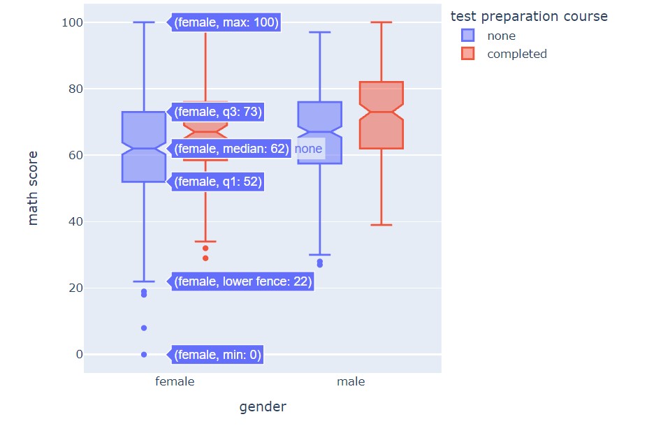
Box Plots using Plotly
Box Plots are a great way to understand data distribution. They depict numerical data using quartiles.
fig = px.box(stud, y="math score")
fig.show()
Output:

The minimum on a box plot shows the lowest data point except for some of the outliers.
The maximum shows the largest numerical data point.
Median is the middle value of the data distribution.
Then, the lower quartile is the 25 percentile and the upper quartile is the 75 percentile.
Let us try some customised box plots.
fig = px.box(stud, x='gender',y="math score")
fig.show()
Output:

fig = px.box(stud, x='gender',y="math score", points="all")
fig.show()
Output:
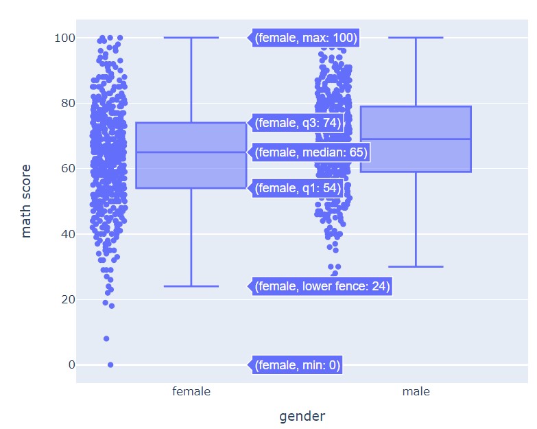
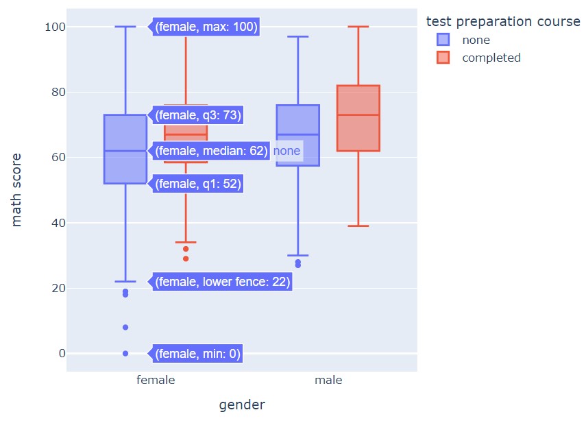
fig = px.box(stud, x='gender',y="math score", color="test preparation course")
fig.show()
Output:
Now, let us add a notch.
fig = px.box(stud, x='gender',y="math score", color="test preparation course", notched=True)
fig.show()
Output:
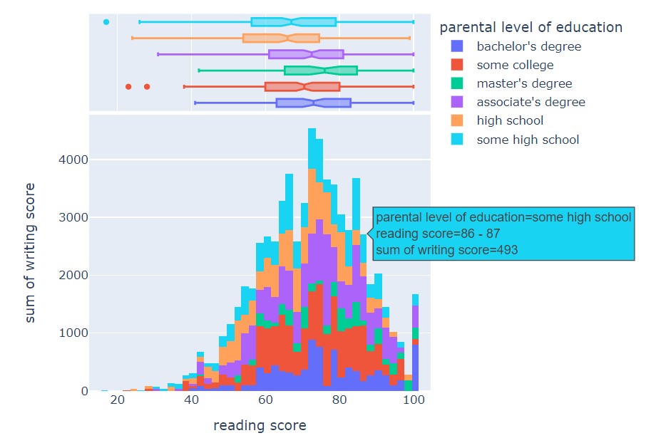
Histograms
Histograms are an excellent plot to understand the frequency distribution of numerical data.
fig = px.histogram(stud, x="math score", nbins=20, color="gender")
fig.show()
Output:

Let us customize it.
fig = px.histogram(stud, x="math score", nbins=20, color="gender", marginal="rug")
fig.show()
Output:

Let us make a data visual show proper representation of data by adding a box plot as well.
fig = px.histogram(stud, x="reading score", y="math score", color="gender", marginal="box", hover_data=stud.columns)
fig.show()
Output:

Such visuals are really great in understanding how the data is spread, and we can interact with the plots.
fig = px.histogram(stud, x="reading score", y="writing score", color="parental level of education", marginal="box", hover_data=stud.columns)
fig.show()
Output:
We had a look at major visualization methods in Plotly.
Code (Kaggle Notebooks):
Image Sources-
- Image 1 Source: https://www.pexels.com/photo/man-in-black-suit-holding-a-digital-tablet-and-looking-at-data-on-screen-7567595/
- Image 2 Source: https://www.pexels.com/photo/woman-programming-on-a-notebook-1181359/
All other images are code plots, made by the author.
About me
Prateek Majumder
Analytics | Content Creation
Connect with me on Linkedin.
My other articles on Analytics Vidhya: Link.
Thank You.
- "
- 100
- 3d
- 7
- 9
- Action
- AI
- All
- Alphabet
- Amazon
- among
- analysis
- analytics
- Apple
- applications
- around
- article
- articles
- asia
- audience
- Australia
- bars
- BEST
- Big Data
- Bills
- Bit
- Box
- bubble
- bus
- business
- california
- Campaign
- Canada
- car
- change
- Charles
- Charts
- checking
- Circle
- code
- commercial
- community
- company
- computers
- content
- Costs
- Dash
- data
- data analysis
- data storage
- data visualization
- day
- Deals
- deep learning
- delivery
- Demand
- Design
- Development
- digital
- digital technology
- distance
- Dutch
- Education
- Engineering
- estate
- etc
- Excel
- exploration
- eye
- Features
- Fields
- Fig
- Figure
- finance
- First
- Flexibility
- Focus
- food
- food delivery
- Free
- function
- GDP
- Gender
- General
- good
- grab
- great
- Growth
- guide
- healthcare
- here
- High
- hold
- housing
- How
- HTTPS
- Human Resources
- image
- Including
- information
- insights
- interactive
- interest
- Internet
- investment
- IT
- Labels
- language
- large
- lead
- learning
- Level
- Leverage
- Liberty
- Library
- licenses
- Line
- LINK
- Lists
- Long
- machine learning
- major
- Majority
- Making
- map
- Maps
- Marketing
- math
- Media
- Melbourne
- Metrics
- Microsoft
- monitoring
- notebooks
- Offers
- online
- Options
- organization
- organizations
- Other
- Pattern
- People
- performance
- perspectives
- picture
- Platforms
- Popular
- population
- power
- Power BI
- Predictions
- Predictive Analytics
- present
- price
- Price Analysis
- Produced
- Product
- Programming
- project
- projects
- property
- purchase
- Python
- quality
- range
- Reading
- real estate
- regression
- Relationships
- research
- Resources
- retail
- Risk
- Rooms
- sale
- sales
- School
- Science
- scientists
- Series
- Share
- shared
- Simple
- Size
- So
- Software
- sold
- Solutions
- speed
- spread
- start
- started
- State
- stock
- Stocks
- storage
- store
- Strategy
- Student
- Study
- support
- SWIFT
- Tableau
- teacher
- Technology
- tells
- test
- time
- tips
- track
- Tracking
- traffic
- Trends
- Update
- Updates
- us
- users
- value
- visualization
- web
- Web Traffic
- Website
- websites
- week
- WHO
- words
- Work
- writing
- X
- year